


Inspector Dashboard
Using Data to Drive Decisions
Project Overview
I was a lead designer working alongside a team of 4 developers and 2 product managers to help users navigate and troubleshoot Inspectors.
Using user tracking data and information from past navigation usability tests, we were able to design a reimagined Inspector Dashboard, centralizing key information to allow users to perform tasks such as creating new inspectors, fixing broken or misconfigured systems, or tracking down data.
This project highlights the importance of utilizing user tracking data to help uncover and contextualize user behaviors and mental models.
Success Metrics
10% lift in Weekly Page Visitors
23% lift in Inspector Management actions
19% decrease in Misconfigured Inspectors.
Project Details
Company: Liongard
Timeline: Oct 2022 - Dec 2023
Roles: Research, UX/UI Designer, Engineer Handoff
Tools: Figma, Pendo

Liongard aggregates information from many sources from firewalls to servers using Inspectors, which are individual micro-applications that gather information from various sources into our application. This allows users to then take action on the data like creating alerts, reports, etc.
Pinpointing the Problem
Product approached Design with a task to improve how users discover and debug Inspector misconfigurations.
But first, we needed to understand what specific friction points users were going through during their existing workflows. We did this by creating a user journey map and identifying our user’s persona.
"Why isn't Liongard data flowing into my other tools like usual? The last few days are showing no data!"


Discover Error
Users encounter the problem unexpectedly, whether by logging into Liongard for a separate task or finding that data hasn't populated for days in other tools that use Liongard data.
Find the Origin
Users often have to look through 20+ Inspector Types, discovering errors that they weren't aware of.
Fix Issues
Users now have to resolve Inspector issues one by one.
This task grows exponentially per Inspector Type, which is time consuming & frustrating
Problem Statement
Users need an easy way to identify broken Inspectors & given clear instructions to resolve the error quickly.
Using Data to Design Smart
I created tracking metrics within our tool Pendo to gather context and background of our user’s current behaviors and mental models.
Tracking Existing User Behavior (Clicks + Site Heatmaps)
Analyzing Site and Page Traffic

I was able to determine that of the 4 pages housing Inspector information and management actions, almost 75% of user traffic landed on the Inspector Administration Page.
We then honed our problem statement to…
Redesign the Inspector Administration page, to consolidate information across over 78 inspector types to help users easily access and manage relevant Inspectors.
Current Usability Painpoints


Users had a difficult time assessing if their overall Liongard instance was in good health
Users navigate through 3+ pages to find broken inspectors
Common maintenance and debugging actions were not able to be bulk applied
Navigational Cards
The cards were designed to address the pain point of Assessing Inspector Health quickly.
This component
consolidates high level information about a user’s inspectors and
allows users to navigate to these inspectors in one click.
It allows us to highlight key inspectors that need attention and drive users to resolve misconfigured inspectors.

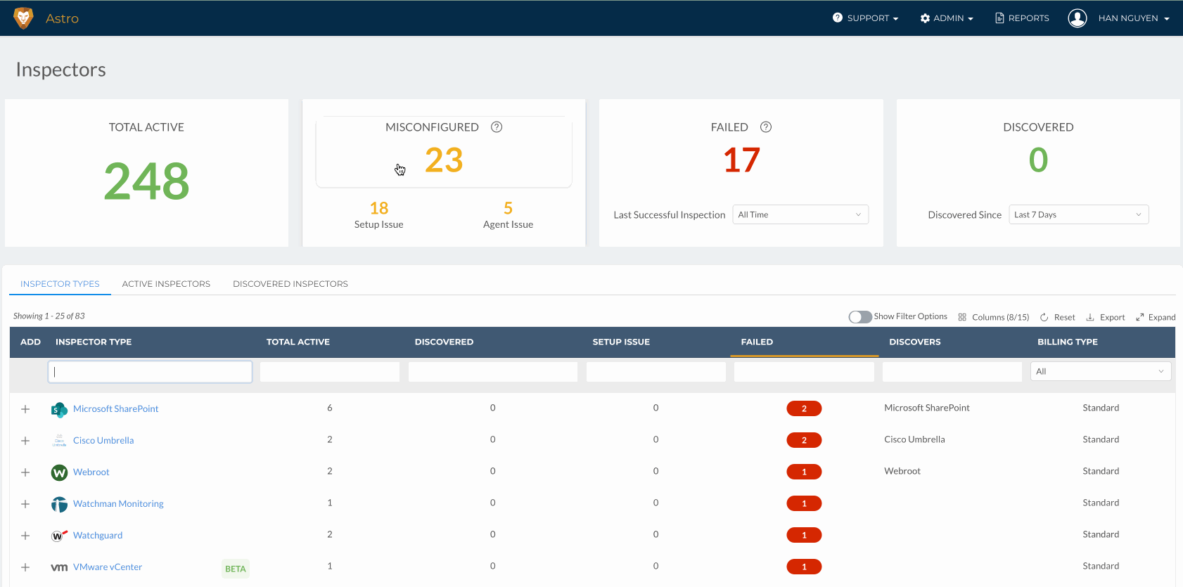
Information Rich Tables
Information rich tables unifies data across 78 different Inspector Types.
This component consolidates granular information about a user’s inspectors and allows them to perform key maintenance flows such as…
Bulk Action Options for common resolution actions
Quick Links to resolve errors
Error Statuses for easy scanning
Resolution Steps to debug/fix broken inspectors

Tabular Navigation
Maintaining 3 separate tabs for primary Inspector flows Users typically perform including…
Adding New Inspectors
Managing Existing Inspectors
Activating Discovered Inspectors
Testing Designs
What I Found
After conducting 5 F2F User Interviews, I grouped common findings together. This process helped me understand the major areas to improve my prototype as well as prioritize which area I should focus on.
Users loved having a single view with all failing inspectors.
“I would gladly remove a lot of these columns just for last successful inspection date”
Users saw the immediate benefit of our consolidated tables of data and the navigational cards that gave them valuable at-a-glance information, saying that the improvements…

"Saves me from going in line by line [to see what inspectors had failed]"
“[Shows me] valuable info without scrolling through”
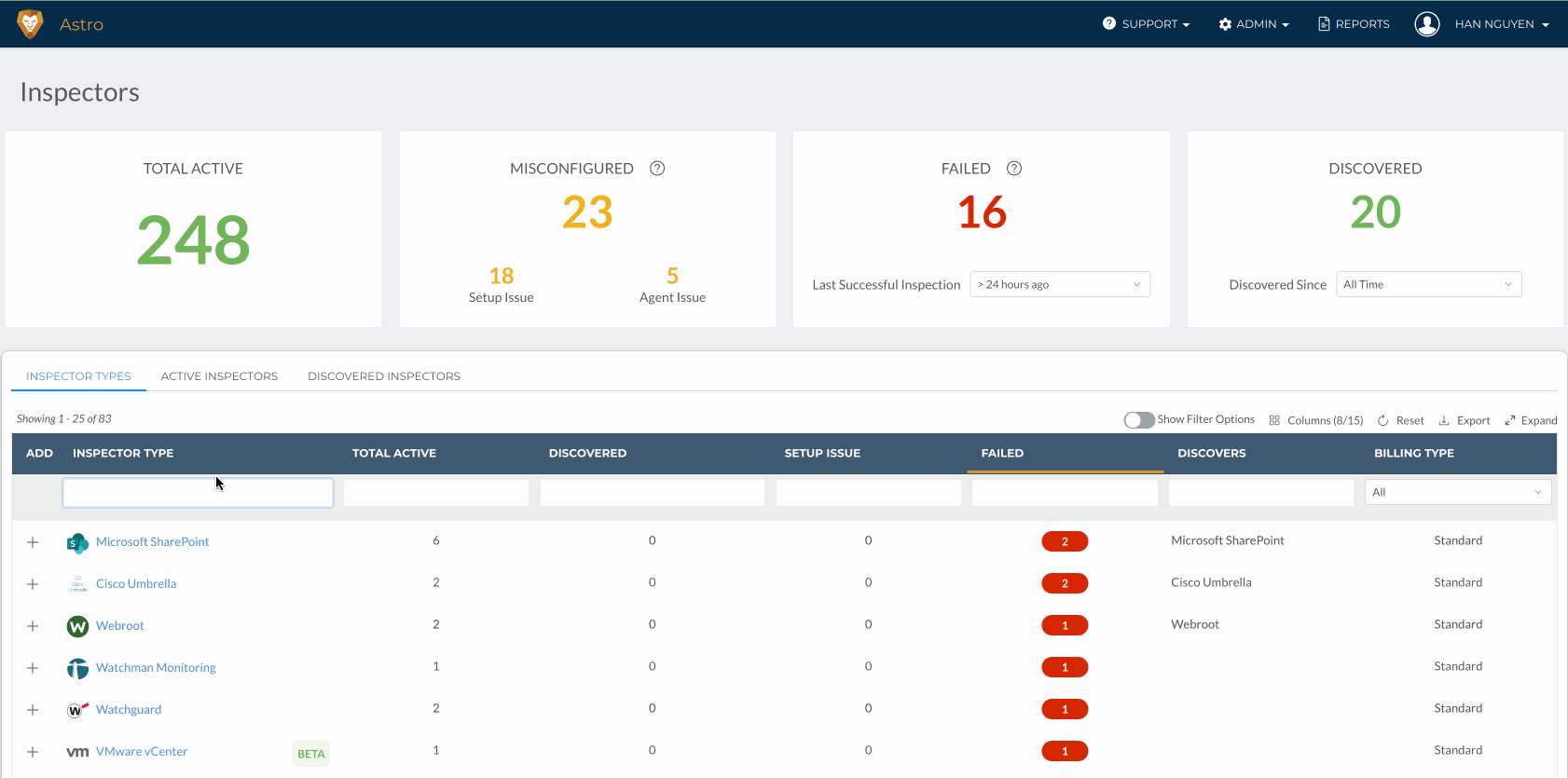
To evaluate the urgency and debugging steps, the age of the error is critical information.
We were able to fine tune the data on our tables to show the most relevant key pieces of information to help users evaluate the urgency of an error.

Quantifying Success & Learnings
Data + Design = Power Duo
Becoming more comfortable as lead designer, I took the time to create data tracking metrics that not only helped our designs as we were going through the Discovery phase, but also allowed us to quantify the efficacy of our designs.
This project was an incredible exercise in utilizing creative ways to gain insight into our user’s mental models. It allowed me to utilize my past experiences as both a software engineer and data analyst. Combining data with a designer’s natural empathy for their users, it produces designs that accurately target user’s pain points.
Our designs drove…
10% lift in Weekly Page Visitors
23% lift in Inspector Management actions
19% decrease in Misconfigured Inspectors.